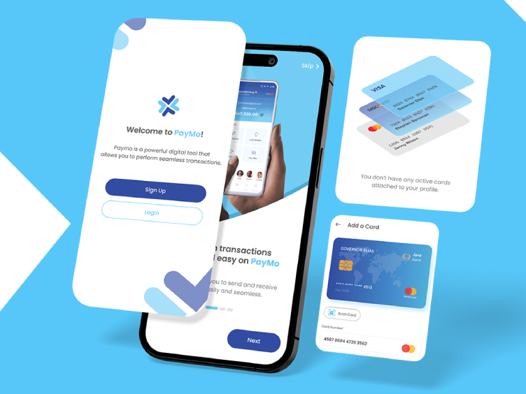
Crafting a Symbol of Trust and Simplicity
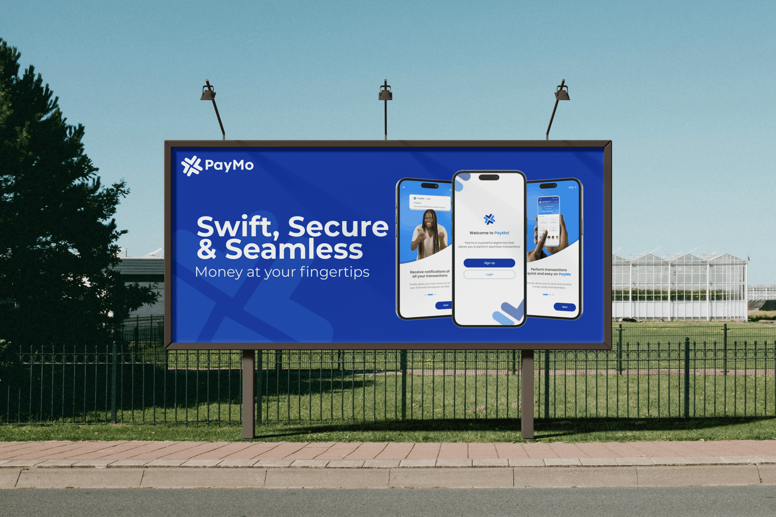
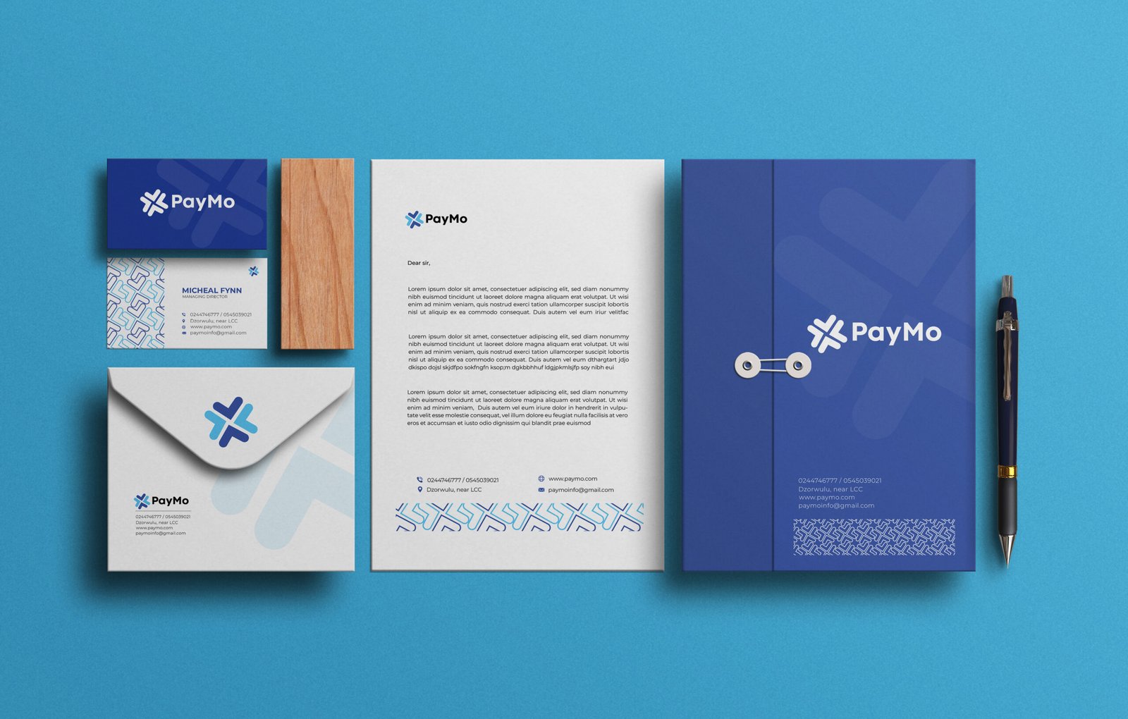
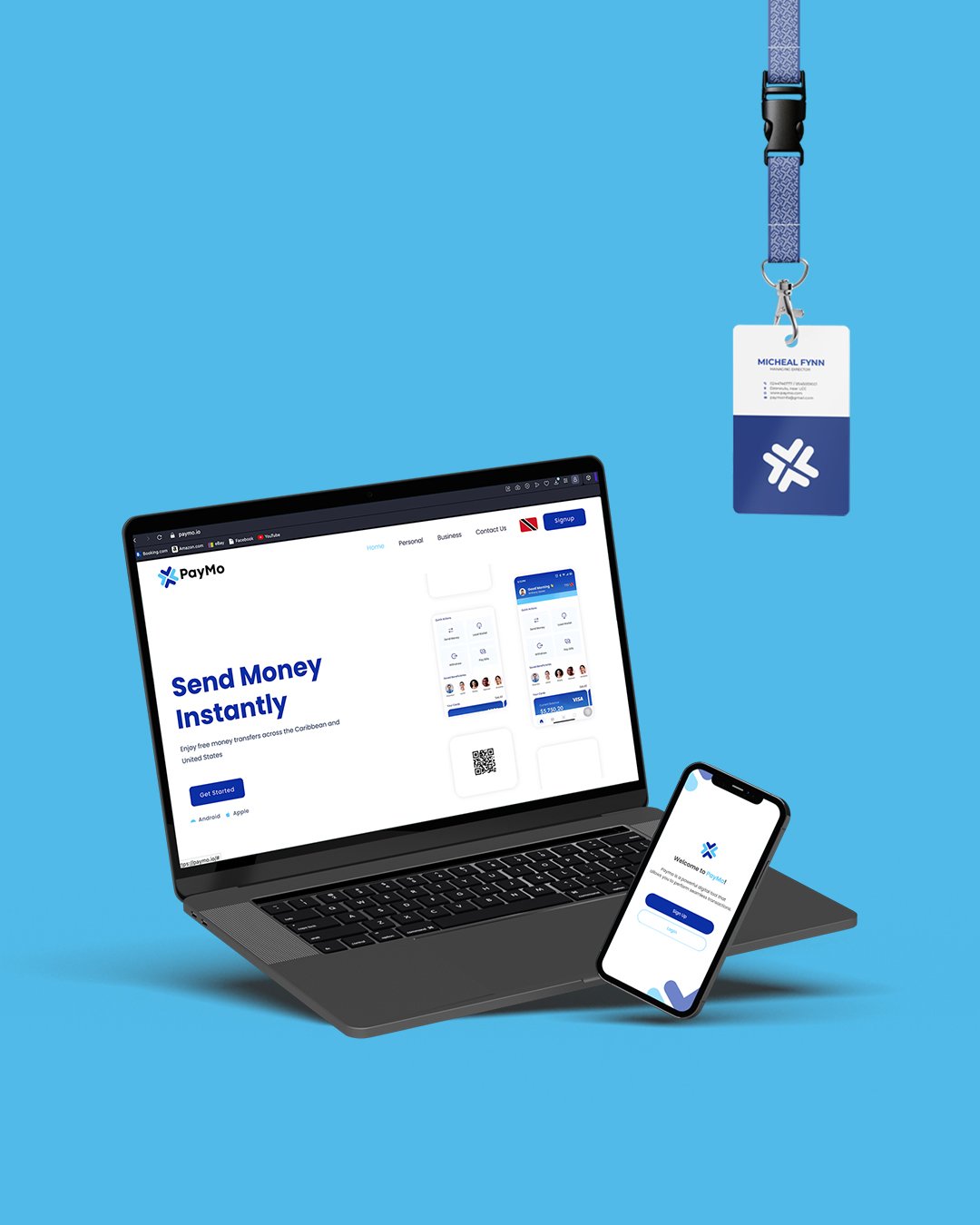
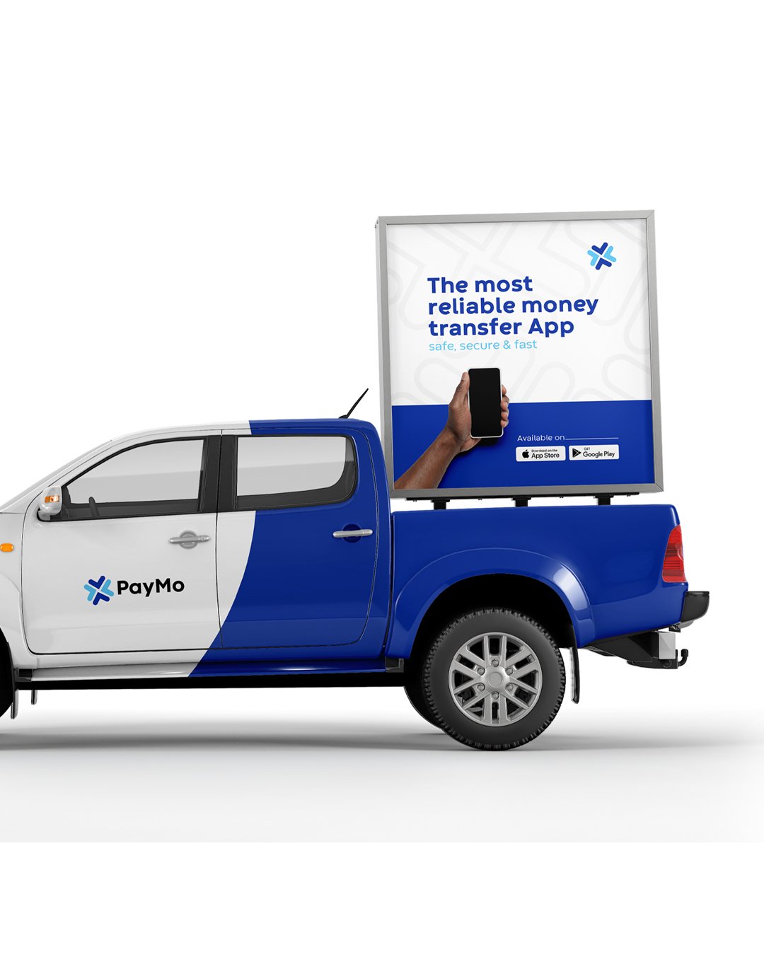
PayMo approached ThinkTech with the goal of creating a brand identity that reflects speed, security, and ease of use in digital financial transactions. Our team developed a modern visual identity centered around a distinctive logo concept that communicates seamless money movement while reinforcing trust and reliability. Every design decision was made to ensure the brand feels approachable, memorable, and ready for the evolving fintech landscape.
A Concept Built Around Connection
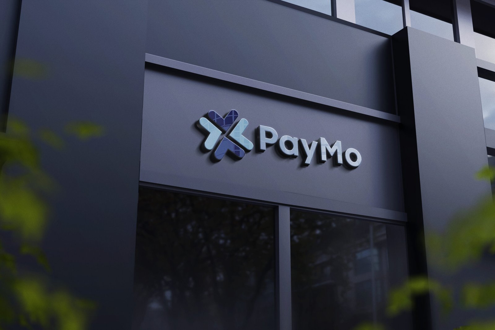
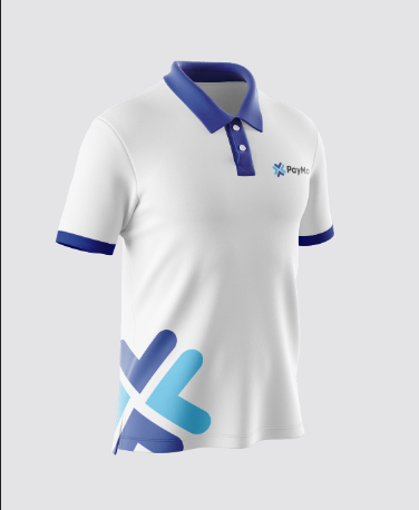
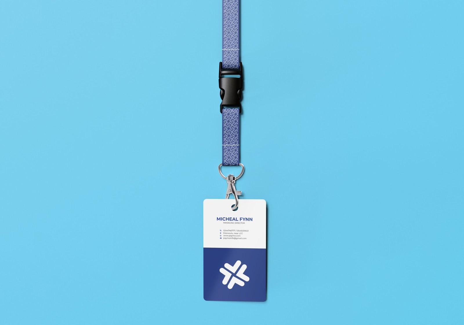
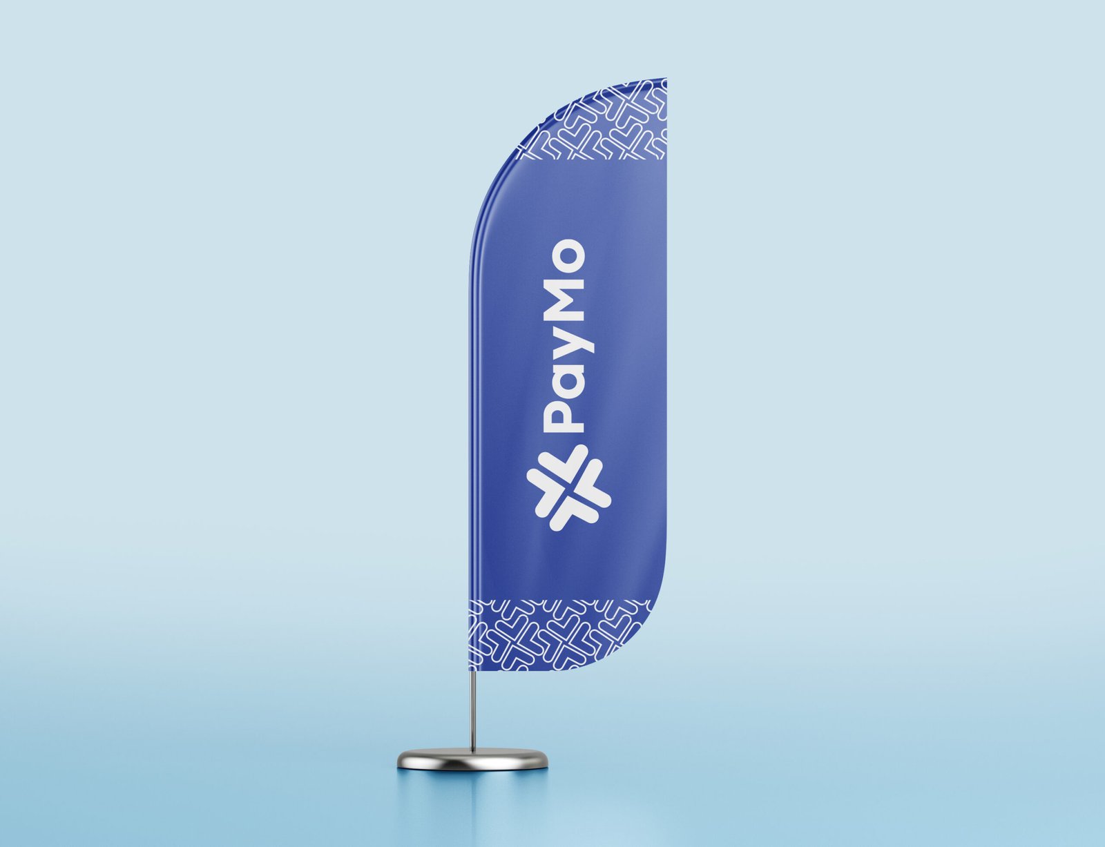
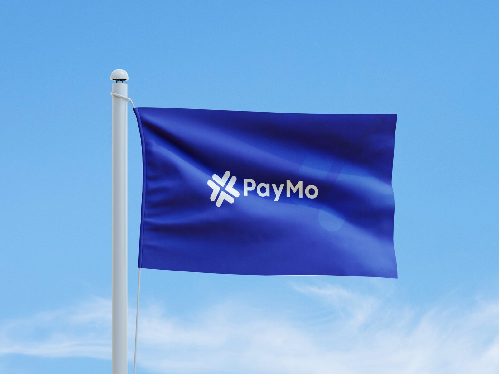
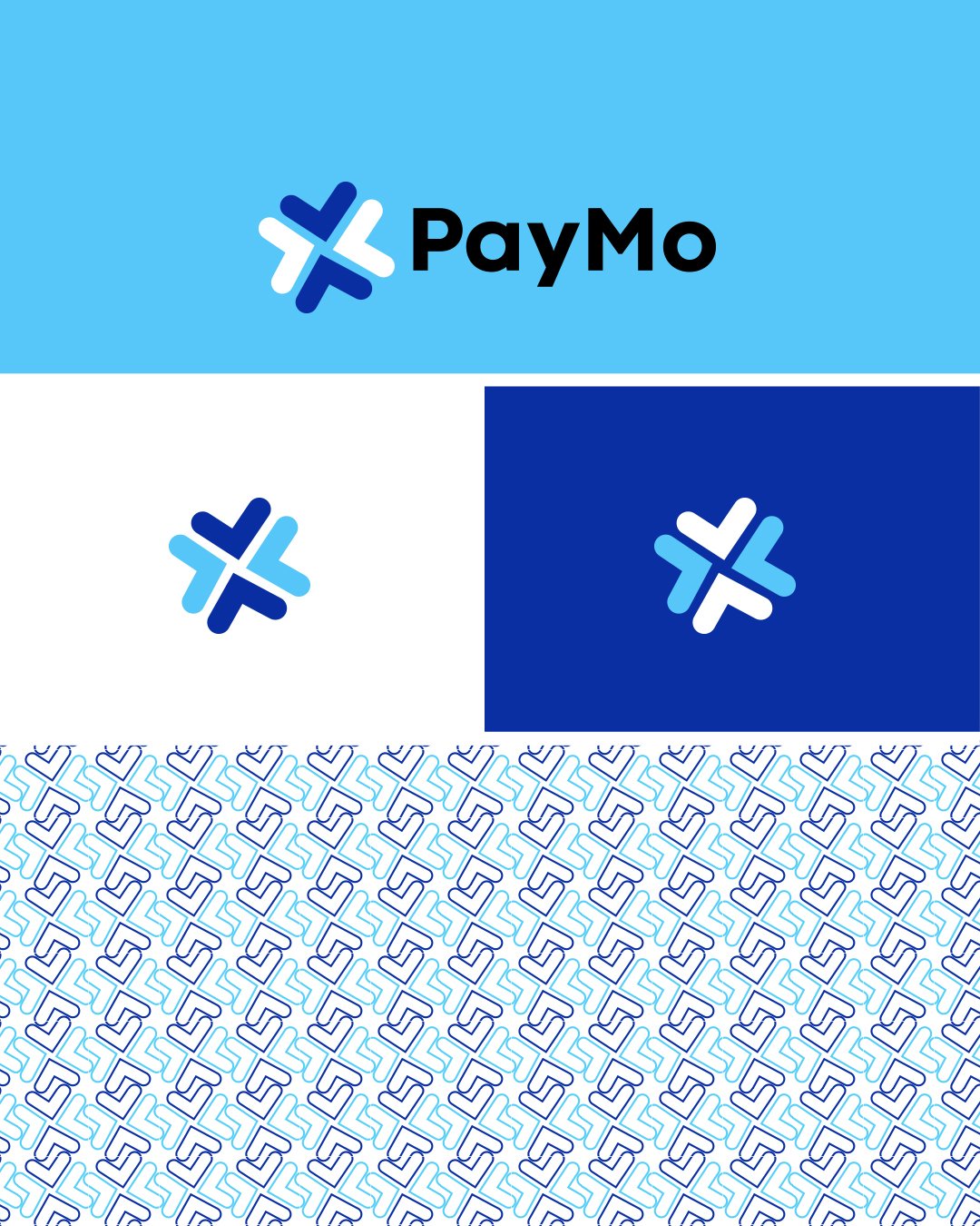
The logo was designed using four directional arrows, symbolizing the effortless flow of funds between users while representing connection, accessibility, and continuous movement. Together, these elements form a clean, recognizable mark that also subtly resembles a check symbol—reinforcing successful transactions, confidence, and dependability.